Tuesday 28 September 2010

Evaluation

Throughout this project I have been working towards completing a Brief given to us by Revolution Art to create a poster or image underwater. Overall I feel this project went well I had a few moments were I had to change my idea but I feel that’s all part of the process. I am really pleased with my final outcome in the project because I haven’t really worked with Photoshop before so everything I have done has been learnt in a short period of time.
Working with Photoshop has been a new way of working for me coming from 3D and Fine Art background, Photoshop didn’t really come up in my other course’s unless you wanted to use it and I never really designed anything that needed it. So learning the tools in Photoshop has been the hardest thing to do. I mainly found tools I like to work with Such as the Smudge, Burn, Paintbrush and Stamp. I used mask’s allot in this project to change colour setting and putting shadows into my image. Using the Tools was very difficult at first although I did get the hang of smudge very quickly because it meant I could be creative using the touch screen to make an image that I wanted. I found it hard to get the hang of the stamp tool because it isn’t made to draw a continuous line as it makes very harsh straight lines through the image
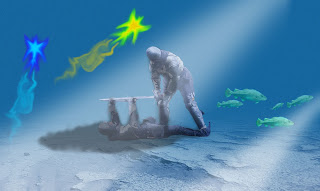
My final outcome certainly isn’t amazing however I feel it portrays all the skills I have learnt in the demos that I have done with the class. If I could do it again I think I would have perhaps manipulated the image of the knights more however with my lack of Skill in Photoshop I think that would have got too complicated and I would have ultimately failed in producing a piece for the short deadline.

My Final Image.

Monday 27 September 2010

Idea Changing and progress

I have changed my idea back to my Knight idea so that I could get my ideas done with the skills I have and in the time limit given to me if I was given a longer time period I would have learnt the skills needed to pull off my mutant fish and sea creatures idea.
This Knight idea was a lot of fun I think it’s because knights and things along those lines interests me and inspires me. I have used Tools like Smudge to create my spirits and burn Tool to burn the Armour of my Knights
To get this effect onto this picture I used the Gradient tool and had it dark blue to fade to back ground. To create the sea. I then used the lasso tool to cut my knights out of the original image then pasted them into the image and reduced their opacity to make the fade into the picture making them seem like there meant to be in the image. In the next step I took the lizard fish I had created for my last idea and placed it into this one I then copied the fish and placed them were I thought they would fit. Each one has a different opacity to give a sense of depth and the fish being further away than other fish. The Next image is after I used the paint brush to create and light blue and dark blue circle on top of each other then used smudge to shape it into the almost creature shape  it has created.  I then used a paint brush and smudged a trail behind it so that it had a sense of motion. Then after I like the positioning of the trail I used Twirl effect on it to make it look like the water distorts the trail. I then copied the creature and changed the hue and saturation.


This is what I am considering as my final poster at the moment however I am going to manipulate it more and see what I can come up with.

After manipulating my image and changing things I decided that every time I change it I make it worse or disfigure the spirits that I put into my image however I did mess around with the Hue and Saturation and came up with an image that almost makes it look like a river of larva but I don’t think it really fits my Brief.


Wednesday 22 September 2010

Sharks Changing

this is the shark i started with and i have been attempting to merge a rhinos head onto it.

This the shark after i just started

And this is me after merging it slightly more this is a very hard process and it is taking longer than i exepted but i think it should make a good result but i have back up plans if it doesnt quite work out.

Typography

Typography
There are three types of script styles and they are.
Sans-Serif
Serif
Script.
This is me using text in a photoshop picture. this will come in handy later on because i can use it to make titles on images that i design

Tuesday 21 September 2010

Design Idea's

Design Idea One
My first idea was to take a well known land mark from Plymouth such as a building in town or stuff like that and then destroy then it to make it almost unrecognisable then submerge it into the depths. However I felt this idea was too common in the end and wouldn’t really have much depth in its self therefore decided against doing this idea.
Design Idea Two
My Second idea was to do something along the lines of my interests like Viking Re-enactment and then submerge two duelling warriors into the depths for an epic fight. However I thought it would be too bland and therefore decided to do a whole battle line shot taken from one of my Re-enactments, yet again I found a problem while trying to test my idea. I didn’t think it through and jumped into a project that would have been too complicated for my lack of skills in Photoshop. Ultimately I would have had a good idea and not been able to pull it off.
Design Idea Three
My Third idea was formed after my demo today with merging animals’ heads so I have decided to make mutant sea creatures that will be in my underwater scene. I will take different and merge them just like the hippo and lizard that we did in class but maybe put heads of land animals on fish and stuff or even add fish heads onto land animals’ bodies and eventually put them all onto the same scene. This is something I would feel more comfortable doing due to the fact that I have just done it and feel very confident that I could pull it off. If however something happens and I have yet again got over confident this idea has a lot of freedom in the design therefore allowing for quick changes to adapt to difficulties.

Animal Merging

Today we dide a Demo in Class to merge a Hippo's Head onto a Lizards Body this was alot easier than I thought it would be and sparked lots of ideas in my head for posters so I feel this is the direction I will take my project. Mutant Sea Creatures!!!!! These are the pictures I started the exercise with and the last picture is the end result that i created. I had to change the hue and saturation of the hippos head to match the lizards skin then i used the Rubber with lower opacity to make it blend easier. then i colourised the back ground.

Thursday 16 September 2010

Idea Generation

Mind maps done in Group Activities to generate idea and keep our minds flowing