I have changed my idea back to my Knight idea so that I could get my ideas done with the skills I have and in the time limit given to me if I was given a longer time period I would have learnt the skills needed to pull off my mutant fish and sea creatures idea.
This Knight idea was a lot of fun I think it’s because knights and things along those lines interests me and inspires me. I have used Tools like Smudge to create my spirits and burn Tool to burn the Armour of my Knights

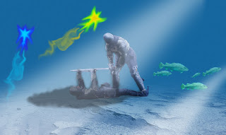
 To get this effect onto this picture I used the Gradient tool and had it dark blue to fade to back ground. To create the sea. I then used the lasso tool to cut my knights out of the original image then pasted them into the image and reduced their opacity to make the fade into the picture making them seem like there meant to be in the image. In the next step I took the lizard fish I had created for my last idea and placed it into this one I then copied the fish and placed them were I thought they would fit. Each one has a different opacity to give a sense of depth and the fish being further away than other fish. The Next image is after I used the paint brush to create and light blue and dark blue circle on top of each other then used smudge to shape it into the almost creature shape it has created. I then used a paint brush and smudged a trail behind it so that it had a sense of motion. Then after I like the positioning of the trail I used Twirl effect on it to make it look like the water distorts the trail. I then copied the creature and changed the hue and saturation.
This is what I am considering as my final poster at the moment however I am going to manipulate it more and see what I can come up with.
After manipulating my image and changing things I decided that every time I change it I make it worse or disfigure the spirits that I put into my image however I did mess around with the Hue and Saturation and came up with an image that almost makes it look like a river of larva but I don’t think it really fits my Brief.


Pretty funky :3, could use something for the top right though (:
ReplyDelete